- About
- Academics
-
Undergraduate Programs
- Civil and Environmental Engineering
- Architecture and Architectural Engineering
- Mechanical Engineering
- Industrial Engineering
- Energy Resources Engineering
- Nuclear Engineering
- Materials Science and Engineering
- Electrical and Computer Engineering
- Naval Architecture and Ocean Engineering
- Computer Science and Engineering
- Aerospace Engineering
- Chemical and Biological Engineering
-
Graduate Programs
- Civil and Environmental Engineering
- Architecture and Architectural Engineering
- Mechanical Engineering
- Industrial Engineering
- Energy Systems Engineering
- Materials Science and Engineering
- Electrical and Computer Engineering
- Naval Architecture and Ocean Engineering
- Computer Science and Engineering
- Chemical and Biological Engineering
- Aerospace Engineering
- Interdisciplinary Program in Technology, Management, Economics and Policy
- Interdisciplinary Program in Urban Design
- Interdisciplinary Program in Bioengineering
- Interdisciplinary Program in Artificial Intelligence
- Interdisciplinary Program in Intelligent Space and Aerospace Systems
- Chemical Convergence for Energy and Environment Major
- Multiscale Mechanics Design Major
- Hybrid Materials Major
- Double Degree Program
- Open Programs
-
Undergraduate Programs
- Campus Life
- Communication
- Prospective Students
- International Office
UI
UI, the symbol of the SNU College of Engineering
Engineering - an enabling field that inspires our imaginations.
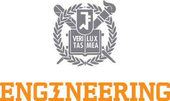
Primary Identity
The UI for the College consists of a laurel crown superimposed on a pen and a torch laid across each other, with an open book and the school’s gate symbol in the center. The laurel symbolizes victory as well as the reputation and honor gained by academic achievement, representing Seoul National University as a member of the top echelon in academics. The pen and torch represent the pursuit of knowledge and the passion to light the nation’s path into the future.
Color
Along with the symbols and the logotype, the colors identify the SNU College of Engineering. They are used in various visual media to represent the image of the College.
C0 M2 Y0 K60
R129 G128 B134
C0 M53 Y100 K0
R247 G143 B30
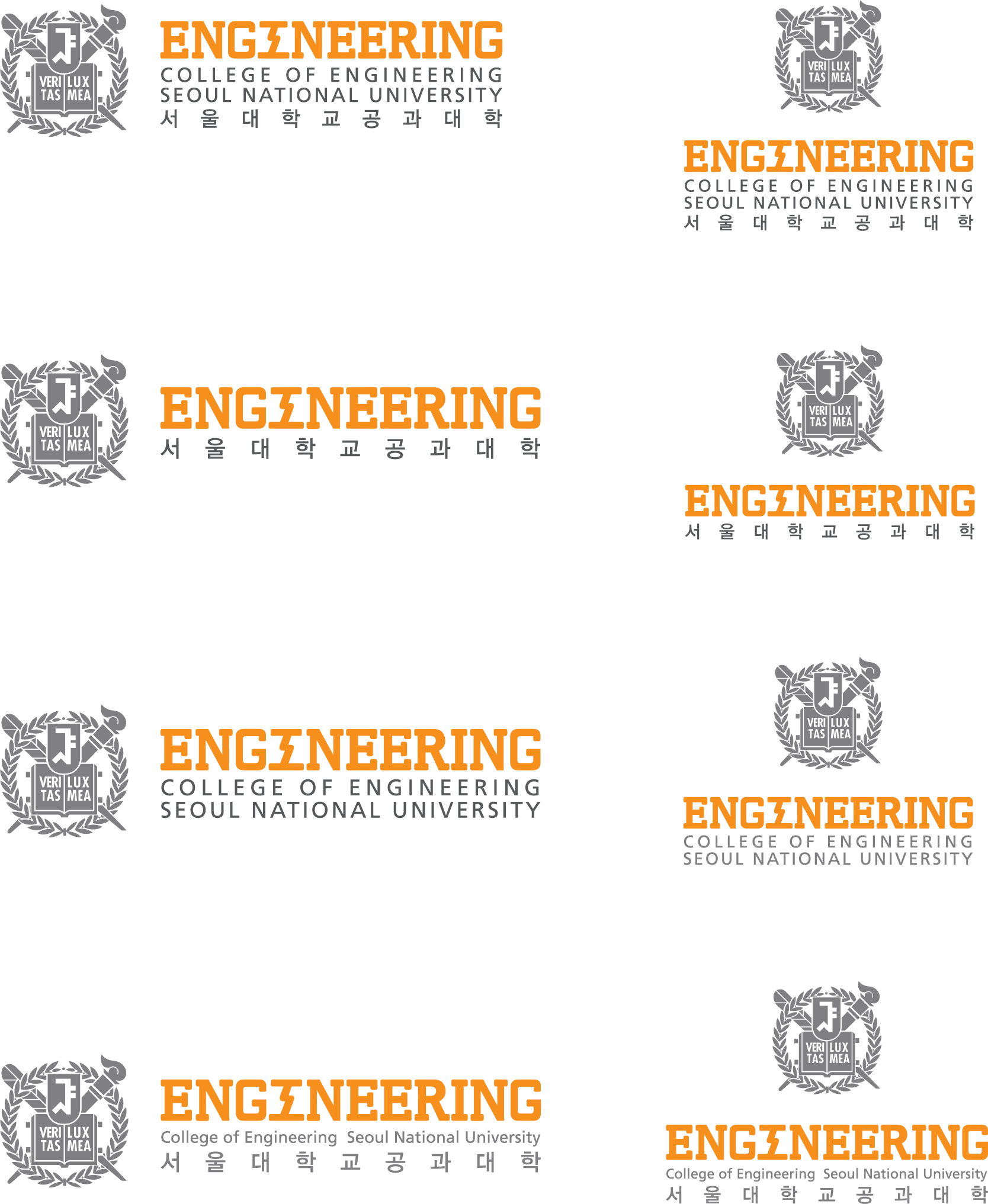
Logotype
The logotype represents the official mission of the College. It is combined with the Seoul National University mark.